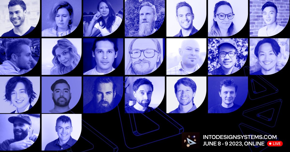
Last week I attended an online conference from Into Design Systems with inspired talks from industry experts. Here are 5 things that stood out over the two days.
Everybody loves tokens
It's no surprise to see design tokens featuring heavily in talks once again. They've accelerated innovation in design systems and most teams have experimented with them or at least shown an interest. We use design tokens at Condé Nast to empower brands with crafting unique visual identities . It's how Vogue looks like Vogue and Wired looks like Wired. They play an influential role in creating a shared work language across our cross-functional teams.
The sentiment is shared at the Into Design Systems and it's fascinating to see how organizations and experts tackle similar issues in different ways. How we name and structure design tokens seems to be a hot topic, but how we manage design tokens is pivotal to long term system health.
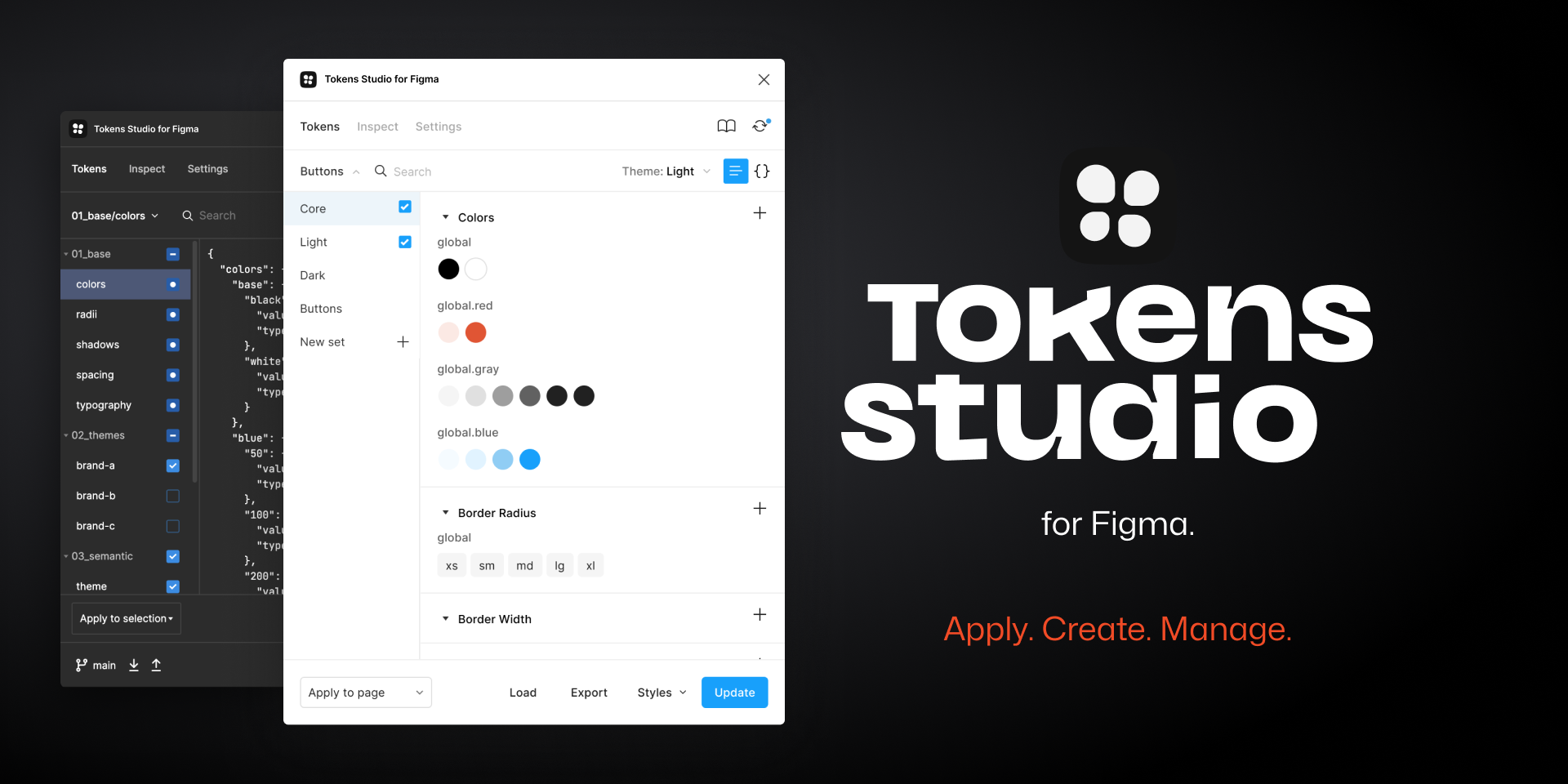
Token Studio crops up in nearly every talk. It's a popular tool for design systems experts to manage tokens in Figma, especially for teams that aren't equipped with resources to build their own tool. We have our own custom plugin, as do Spotify, but the scale of our problem space requires something more bespoke. It's clear to see, from the demos, how empowering it is for teams to manage token decisions in Figma. I love community tools that are easily accessible.
Jan Six and Andrew L'Homme from the Token Studio team share a new resolver and generator sandbox tool. It blows everyone's minds in a good but scary way. I'll need to investigate the alpha more but I'm left with a thought: at what point does a system become more like software? I love the accessibility of their Figma tool, especially for designers, so I hope future features continue in this way.

There are many so token analogies
Okay, literally every team has their own analogy for explaining design tokens. Valentino Baptista of Fintama had about four of them. Atomic design cropped up once again, this time with an additional "ions" bucket for tokens. There was a food processing analogy, not my favorite, and a painting metaphor. They all do the same thing: to explain how design tokens work in a non-technical way.
The one with the most meme potential was the Batman analogy. There can only be one Batman, but the actors behind the mask who play the superhero can vary. This one won't stick but it's a great excuse to include a picture of Val Kilmer for cheap laughs.
My favourite one is perhaps from Louis Chenais of Specify, another token management tool. If the design system is the place or town, then design tokens are the language the town speaks. It's wonderfully simple, especially when words store meaning.
Artificial intelligence loves constraints just like design systems
It didn't take long for artificial intelligence to come up given the hyperbole this year. Although we didn't have a detailed discussion on the topic until day 2 when we met Chris Strahl and Evan Lovely of Knapsack.
Chris starts off with a hot take: artificial intelligence has huge potential but most examples are, at best, technical demos and, at worst, gimmicks. It's difficult to disagree when there are few practical applications.
Evan makes the case that artificial intelligence and design systems aren't too dissimilar. Both love constraints and both can help with productivity that perhaps they're a good fit? He says artificial intelligence can be a part of design systems to help us to create code, from design, or make code easier to work with for everyone.
I liked the AI personas they shared:
- The librarian provides knowledge of the design system
- The assistant supports designers in the creation of things
- The creator generates content, prototypes, tests (truly generative)
- The manager functions as agent inside the design system in pursuit of optimization based on metrics
Chris and Evan shared some practical examples such as chatbots that query the system or smart suggestions that can automate simple tasks. The Spotify team, in an earlier talk, actually shared some real examples of these in the wild.
It's clear to see that artificial intelligence presents new opportunities, especially in the pursuit of automation, but it needs to solve real user problems to avoid being another gimmick.
The future of design systems is automated
Perhaps the most interesting talk of the conference came from Juli Sombat and Tiago Catita of Spotify. The size and scale of their problem space is closer to Condé Nast than other companies attending. In fact, the chat freak out when they hear that Spotify's design systems team is 3 cross-functional squads of 28 people. One can dream.
Juli says they aim for coherence, not consistency.
It's a reminder that sometimes design system purity isn't always realistic at large organizations. Designers will detach components and product will prioritize things over implementation. When there are hundreds, almost thousands of consumers, it becomes a challenge for design systems teams to govern and almost impossible for them to police. Instead, we can promote what "good looks like" and help consumers to make better decisions in pursuit of cohesion.
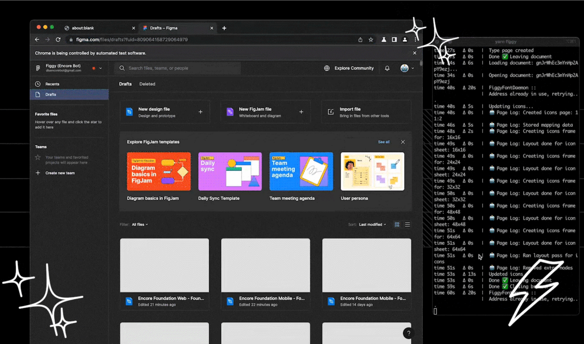
Although, when design systems like Encore grow in size and complexity, it presents a real human problem for its customers. The learning curve gets steeper, which can introduce efficiencies to the product development process. Spotify see automation as the answer to its growing pains.

Tiago starts off by defining automation as the act of controlling a process by reducing human intervention. He sees the benefits as removing repetitive tasks, reducing risk of human error, reducing time spent on answering support questions, and increasing cohesion between design and code. It's about finding opportunities to be more efficient so that contributors can spend more time doing what they do best.
They share some examples of what's worked for Spotify. One being computation design tokens where 1 design decision equals many design values. They have a base value and use mathematical calculations to generate more values, like a programmatic color scale for example. Juli introduced them to Condé Nast while she was design lead and they can dramatically reduce the number of design tokens in the system.
Juli and Tiago also share examples of their army of bots, chatbots, Slackbots, and custom plugins, which is really impressive to see how they handle scale. It proves that automation can expand the influence of the design systems team across a wider product landscape.
Spotify ended with something that resonated really well: close collaboration between design and engineering is fundamental to their success. When we work well together, good things happen.
Combinatorial explosion is a thing
An interactive Q&A featuring the Design System Office Hours podcast duo Davy Fung and PJ Onori, from Meta and Pinterest respectively, provided some great insights for designers looking to grow their career in design systems. As a hiring manager, it's great to see a real focus on people's problem solving skills and eagerness to learn, as opposed to technical skills in design tools. Sadly, PJ says there's no magic wand for finding systems thinkers. Both he and Davy like candidates who can understand the problem space but also execute on solutions.
One moment in this talk stood out to me because it hits home so many points I've been trying to articulate for years. It came from PJ advocating for simplicity i.e. remove as many (low value) things as possible. If design systems grow complex, with too many things, then it becomes the antithesis of what it wants to achieve.
There have been lots of great talks, with fantastic insights into the future of design tokens and artificial intelligence, but as a community we should still advocate for our users: making sure design systems are accessible to everyone. Sometimes I fear design systems are increasingly becoming over-engineered and under-humanized.
PJ uses “combinatorial explosion” to explain that most programs have an exponential growth rate, fueling complexity as the number of possible combinations increases with the number of entities. Our goal should be the same as artificial intelligence: to avoid the combinatorial explosion issue as much as possible. Reduce the burden for our consumers by requiring them to learn fewer things.
Design systems are meant to improve efficiency, accuracy, and collaboration. Let's stop complexity from getting in the way of that end goal.


